Our brand and product logos are clear, impactful and recognisable. All carry our simple blue and white color palette with design variations depending on major events within the company.
In everything we do, we aim to bring focus and clarity to what we do, whilst still expressing our personality as best we can. Our logos are direct, clear, and impactful. To accomplish this, we adhere to the guidelines below.
Colour
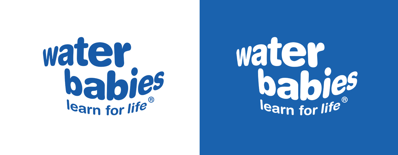
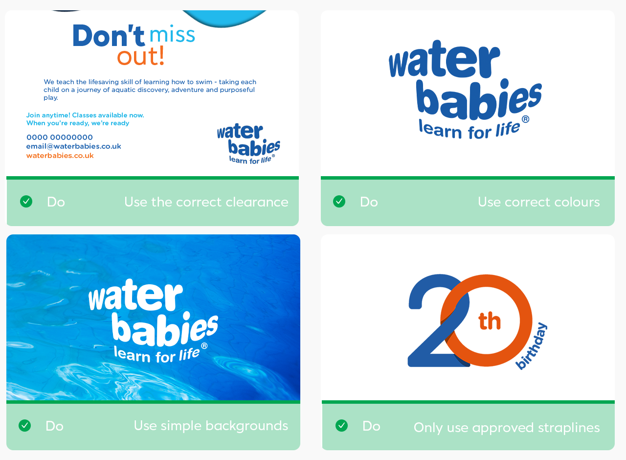
The Water Babies logo is available in 2 colour ways. Blue and white. The Blue version works best on a white background, and the white work version should be used on our blue background or over suitable imagery.
We have clear PNG versions of our logo available, as well as on white and blue backgrounds.
As our logo is small and wide, we use the same logo across all areas of design.
Clearance
To ensure logos are clearly visible, surround them with space that is free of text, graphics or illustration that might cause visual distraction.
Ideal clearance:
Use 3 of the the "W" of the Water Babies wordmark to define the ideal clearance around the logo.
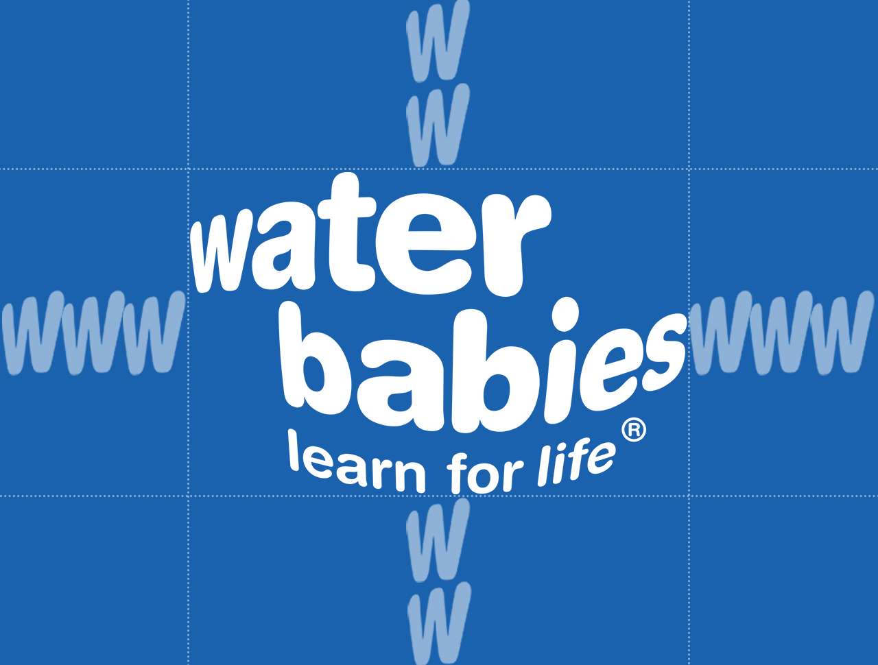
On collateral such as adverts, the ideal clearance is not possible to fit all aspects of the advert in and for the logo to still be big enough to be recognisable and legible.
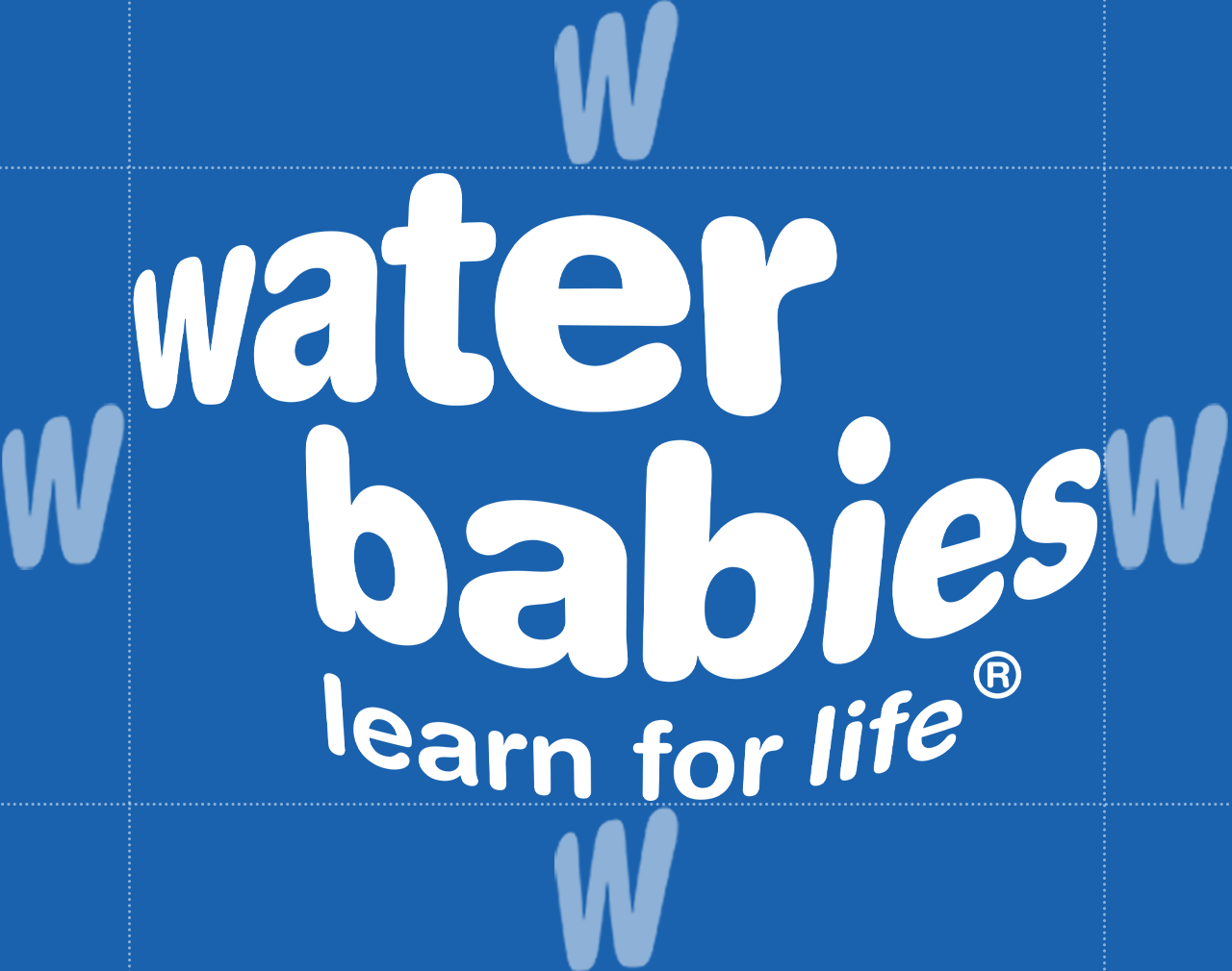
Minimal Clearance:
Use the the "W" of the Water Babies wordmark to define the minimum clearance around the logo.
Do's and Don'ts
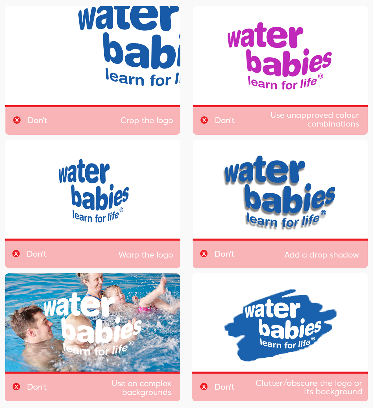
To maintain the integrity of the Water Babies logo and promote the consistency of the brand, please do not missuse it outside of the brand guidelines. The Do's and Don'ts are listed below.
If you have anymore questions or are unsure of anything, please contact marketingsupport@waterbabies.co.uk and we will be happy to help in any way.